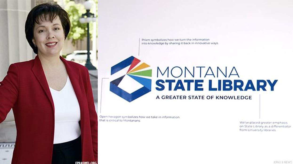
A logo for the Montana State Library was rejected over concerns it resembles a Pride flag.
The Montana State Library Commission voted 4-3 against the logo on July 5, having already paid Milwaukee-based company Hoffman York $130,000 from non-taxpayer library foundation money for the design.
The full contract for the new design and its rollout is for $292,500, according to the Associated Press.
The new logo featured several rays of different colors and is predominately blue, which was supposed to represent learning information and sharing it, according to local TV station KTVH.
At a commission meeting last month, a representative of Hoffman York, Addie Palin told the group, "People really liked it for the way that it provided clarity. How the prism, like the library, is a vehicle for distributing information in a new and different way."
Several commissioners at that meeting brought up the colors as reminding them of the rainbow and Pride flag.
"I think there are two things you can say today to set off a firestorm in the area of information," Commissioner Tammy Hall, who was appointed by Montana GOP Gov. Greg Gianforte said, the AP reports. "One is a rainbow and one is misinformation. Those are very political, explosive weapons."
The logo's colors were intended to symbolize, "information being trumpeted outward," with no allusion to the LGBTQ+ community. Hall argued that the colors should be replaced with shades of blue, black, and gray.
"I do have to agree with the rainbow," said commissioner Robyn Scribner, according to the Montana Free Press. Scribner, also appointed by Gianforte, said she had "nothing against" the Pride flag. "But I do believe that Montanans possibly could see that, because I did. And I'm a regular Montanan, so I believe that -- I think it can be seen that way."
Commission chair, Kenning Arlitsch, pointed out a difference in the logo and the Pride flag: The flag has 11 colors and the library logo has four. He said, "I think it's a stretch to think that this represents a pride flag."
Library staff said that the now-rejected logo did represent the work they do to provide necessary information to the public.
Kevin Hamm, president of Montana Pride responded to the commission's rejection and suggested their reaction reflects a greater issue.
"If you're going to have a problem with a logo and the first thing that you think is 'Oh, it's got bright colors and that's a little too queer for me,' you're a bigot and you have issues," Hamm told the AP. "Don't throw my community under the bus just because all of a sudden rainbows make you think everything's gay."
Two commissioners and the state librarian plan on discussing the ideas for the logo again this month before the commission's next official meeting on August 3.
Follow More Advocate News on Pride Today Below
